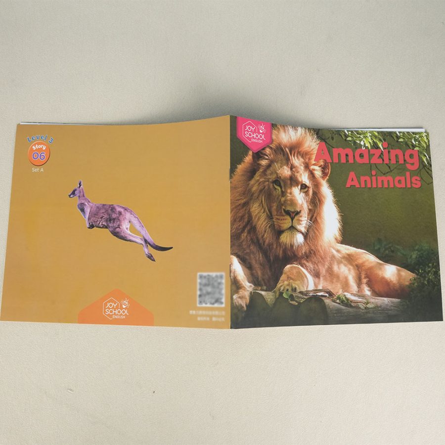
The Cover Design Tips of Children’s Book Printing
When it comes to children's books, the cover design plays a pivotal role in attracting readers. A well-designed cover not only reflects the essence of the story but also captivates the target audience — young readers. As the first point of contact with the book, it needs to be visually engaging and exciting. Whether you're a writer or a publisher, here are some key cover design tips that will help ensure your children’s book stands out and gets noticed.
1. Vibrant and Playful Colors
Children are naturally drawn to bright and bold colors, which is why color selection is crucial. The cover of your book should evoke joy, excitement, and curiosity. Use a combination of colors that are eye-catching, yet balanced. Avoid too many colors that may clash, as simplicity in color coordination often works best. Consider using primary colors like red, blue, and yellow, or pastels for softer tones, depending on the mood of the book.
For example, a book with a lighthearted adventure might use bright, contrasting colors to convey excitement, while a calm bedtime story could use soothing pastels or muted shades for a tranquil feel.
2. Engaging Imagery
Children’s book covers typically feature fun, imaginative, and relatable illustrations. These visuals are often more important than the text, as they visually tell the story and hook the young reader’s attention. Whether it’s a quirky character, a magical landscape, or an action-packed scene, the imagery should give a taste of what the story is about.
For example, a cover for a fantasy book could depict magical creatures or whimsical landscapes. In contrast, a book about friendship might showcase children holding hands or playing together in a cheerful setting.

3. Keep It Simple and Readable
While the cover design should be visually appealing, it should also be straightforward and easy to understand. Avoid cluttering the cover with too many elements that can confuse or overwhelm the viewer. Simple, clean designs work best for children’s books.
The title of the book should be bold and easy to read. Choose a font that is clear, playful, and suitable for the age group you're targeting. For example, use larger, rounded fonts for younger readers and more sophisticated ones for older children. Make sure the text contrasts with the background to ensure legibility.
4. Relate to the Story's Theme
The cover should visually represent the essence or theme of the book. Think about the emotions, characters, and setting of the story, and translate that into your design. A well-designed cover gives the reader an immediate sense of what to expect from the book, making them more likely to pick it up.
For instance, if the book is about a brave character embarking on a journey, the cover could feature that character in an adventurous pose, perhaps against a dramatic landscape. For a book about animals or nature, you could focus on illustrating the main animal characters in their natural environment.
5. Appeal to Both Children and Adults
While the main audience is children, it’s important to remember that adults—parents, teachers, and caregivers—are the ones who will likely be making the purchase decisions. The cover should appeal to both children and the adults who are looking for a book that is both fun and educational. A good way to achieve this balance is by incorporating elements that spark curiosity in both audiences, such as an intriguing title or a charming character.
A balance of whimsical visuals with a touch of sophistication can ensure that your book is appealing to both the young reader and the adult purchaser.

6. Incorporate the Author’s Style
The cover of the book should reflect the author’s unique voice or artistic style. Whether the author uses humor, adventure, or fantasy as the core of their storytelling, the cover design should reflect that tone. If the author has a signature illustration style, incorporate that into the design to maintain consistency across their body of work.
Consistency in the author’s design across different books can also help build brand recognition for the author’s work, so readers can easily identify future titles.
7. Test with Your Target Audience
Lastly, before finalizing the cover design, it's helpful to test it with your target audience—children! If possible, gather feedback from children in the appropriate age group. Pay attention to which elements catch their eye, and ask them what they like or dislike about the cover. This feedback can be invaluable in fine-tuning the design to ensure it resonates with young readers.
Conclusion
The cover design of a children's book is much more than just a visual decoration; it’s a powerful tool that can attract young readers and set the tone for the entire story. By using vibrant colors, engaging imagery, and a clear representation of the story's theme, you can create a cover that is both eye-catching and reflective of the content inside. Whether you’re designing the cover for your own book or working with a designer, these tips will help you craft a cover that children and adults alike will love.
Ultimately, a great children’s book cover has the power to captivate the imagination of a child and ignite their love for reading.


